Millions of mobile applications and trillions of web pages today compete to attract attention and get the time of users. The majority of people spend at least a few hours online every single day and yet, many of those pages and apps are hardly ever used.
Having a visited and active website is one of the smartest ways to make money today. However, this can only work for you if you design a great site, one that offers a quality user experience and attracts the attention of users.
What is UX design?
User experience design is a process that designers use to create a product such as a website or an app that provides a relevant, quality experience to the user. This involves the design of every aspect the user sees or experiences, including usability, unction, branding, and design. It is present across the entire user journey from the moment when they see the product until the moment when they finalize their purchase or leave the site.
A good UX design effectively combines text, layout, graphics, and other interactive elements. These elements, together, form the impressions of the user. With so many choices for users, these days in the form of apps, products, and websites, the sites that offer memorable experiences are the ones they remember.
This brings us to the next point…
Design principles for a great UX
Now let’s take a look at some principles you should be following to ensure that users have a great experience with your design.
Use the Gestalt Grouping Principles to create a great design
Have you heard of these principles? Maze’s guide to Gestalt Grouping Principles will teach you all about them, as well as give you examples of how you can utilize this knowledge to boost the quality of your design.
The Gestalt Grouping Principles are grouping laws based on psychological findings and used in design today. The idea behind them is to help designers build products that are more user-oriented and human-friendly. If done right, these principles can help you lower the learning curve for the user, increase product engagement, and boost the all-around experience for your users.
Finding all this information on your own is not just time-consuming, but basically impossible. However, there is a solution to it. If you want to save the guesswork around and collect user insights before they are outdated, you should consider running product research with Maze.
Since UX design is all about implementing a user-centric strategy, this demands some knowledge of your users and their behaviors. This is why usability testing tools like Maze are so widely used by designers today – because they provide them with enough information to make smart decisions and boost the experience of the user.

Create a hierarchy in your design
Hierarchy is a very important principle of UX design and yet, very few designers practice it today. By attempting to fit all the trends into a design, many fail to recognize the importance of this traditional approach to design.
To create a hierarchy in a design, you need to think through all of the information that the product will contain, as well as the functionalities it offers. You can do this with the help of tree mapping to ensure that every piece of the structure flows naturally from start to finish.
If done right, your website’s pages should be so clearly and easily connected, that your attempt to do this will be invisible, but highly effective.
Awwward’s guide on web visual hierarchy will show you how to aim for a good user experience by creating a hierarchical user interface for your website.

Adopting such an approach is beneficial in many ways. It won’t just make it easier for users to navigate your website and complete their goals faster. It also allows designers to clearly see how their website works and minimizes the work they need to put into making the site more functional and simpler to use.
Make your website more scannable
This might come as a surprise, but most users won’t read the content you worked hard on when they visit the website. They’ll scan it – look at some of the photos, read just a bit of the content, and jump to the CTA if they are convinced to take some action.
This is only expected since most of the users are busy and have many choices for sites where they can find the information they are looking for. The moment when a visitor decides that your content is worthy of their time is when they scan the copy and get the feeling that it will provide them with answers or solutions.
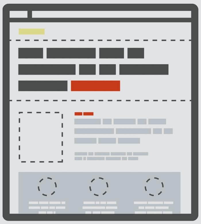
If you want to convince people to give your content a chance, you need to start with the scannable parts of it. Research shows that most of them spend 80% of their time on your website to scan the things you have above the fold. This is what you should focus on for starters.
The experience of users will depend on how scannable you make your interface, as well as on the quality of content you provide. That being said, focus on keywords, headlines, and a design that captures the attention and doesn’t overwhelm the visitor.
Don’t play too much with design patterns
Design today comes with more options than ever. It’s easy to get tempted to use many new patterns, especially if you want your design to stand out. But, by attempting to make your design as unique as possible, you are only making it more complicated.
Users like things they are familiar with. They won’t appreciate a new design pattern for everything on your website. They should know that a link is a link as soon as they see it, and not wonder what part of your design is the actual CTA.
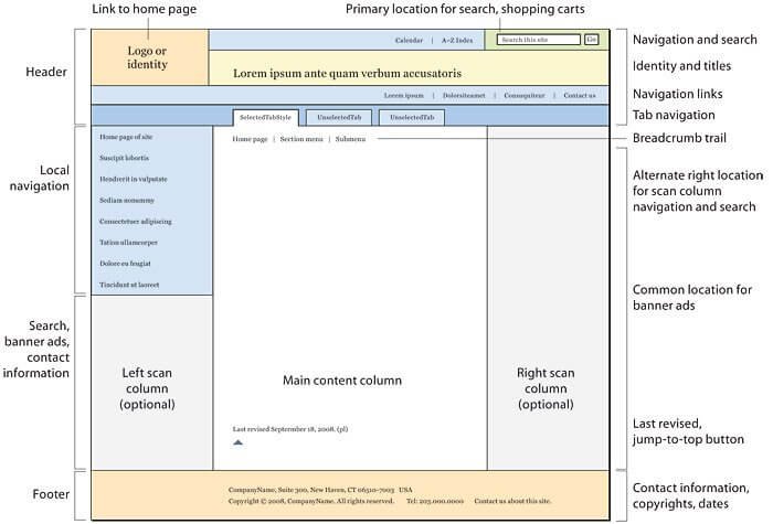
Don’t play much with the order of things on your site, too. Most interfaces today are very similar, and people are attached to that hierarchy. For example, log-in is located in the upper right corner on most sites, so putting it elsewhere will only confuse the user.
Check out WebStyleGuide’s post on website layout for inspiration.

Aim for clarity and simplicity
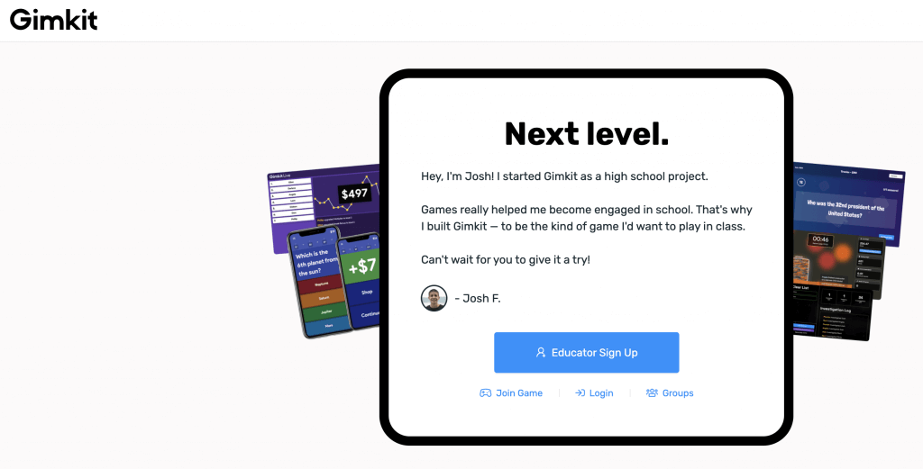
It takes half a second for a visitor to decide if your website is worthy of their time. Not even an entire second! This leaves you very little room for making impressions. That’s why you should aim for clarity and simplicity. If you confuse and overwhelm the user from the start, they won’t think twice before they leave your website.
Users come to your site for a reason – they are looking for some answers and solutions. Don’t let them think about what they need to do next or what you want them to do. Make it simple and straightforward by using similar components, colors, aesthetic elements, and behaviors.
Utilize context for better UX design
How, when, and where users interact with your designs can greatly affect their user experience. In this sense, context means that you should pay attention to devices used to access your website, times at which users look for the information you provide, etc.
Yes, you should optimize your product for different devices either way, but designing contextually means that you should consider many factors. For example, one design can work perfectly when the user sits in a quiet place. But, it can work poorly in a noisy place unless you have subtitles for your videos.
That being said, do a bit of research to learn in what context your design is used.
Make the design easily accessible
An accessible design is easy for everyone to use, including those that aren’t in an optimal location to use a website or cannot do it for some reason. If a person is in a noisy place, adding some subtitles to your videos is a smart idea. The same applies to people whose native language isn’t the one spoken in the video.
Accessibility is all about inclusivity, which is why you should design your website considering people with disabilities, too. This will allow all of your users to have a better and more simplified experience, as well as give more people access to what you are offering.
Some of the best ways to make your design more accessible are:
- Provide enough contrast between your background and foreground
- Pick your color palette wisely and consider color-blinded users in the process
- Don’t use just color to convey information, but also styles like bolding, italic, etc.
- Make sure that every interactive element is easy to identify and use
- Give all form elements a clearly associated label
- Create consistent and clear navigation options across your design
- Stray from using jargon and highly professional language in your content
Ready to make your design amazing?
By following the principles above, you can create a website that looks simpler, is more functional, and appeals to more of your users. The user experience is vital to your design’s success, especially now when the competition is bigger than ever. Good luck!

